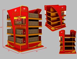
The design aimed to provide a premium look for the brand by adding layers in all perspectives. This created depth and broke the monotony of a rectangular presentation of a mass display unit. We also softened the look with accents in gold that formed part of the branding and applied lighting at one small section to highlight the product.
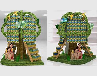
This was a design that truly disrupted. It was almost a literal transformation of one of the brand’s key visuals into a highly functional mass display unit. The brand endorsers, its selected sku’s, among others blended naturally.
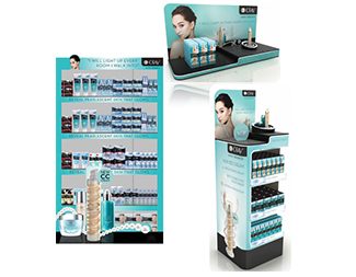
For a full scale project, a design usually includes 3 or more points of purchase that will be applied in the different areas in the store. The featured design was an example of this. It provided a cohesive look applied to a shelf highlight, a top shelf display and a multispot.
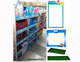
A design that’s truly value adding are Points of Purchase that allow the adjustment of size and height to cover real time a greater no. of shelves with varying dimensions. This calls for greater experience in trade and reengineering design ability.
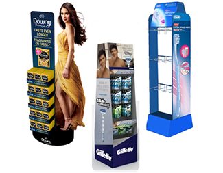
Guided by the standard size of a tactical bin, we ensure flexibility and reliability in terms of designing the form, combining the materials to be used depending on the stack weights of sku’s for display, and applying the right mix of printing technology for instance the inclusion of a die cut and in some projects even thermoforming.
Copyright 2018. 11FTC All Rights Reserved